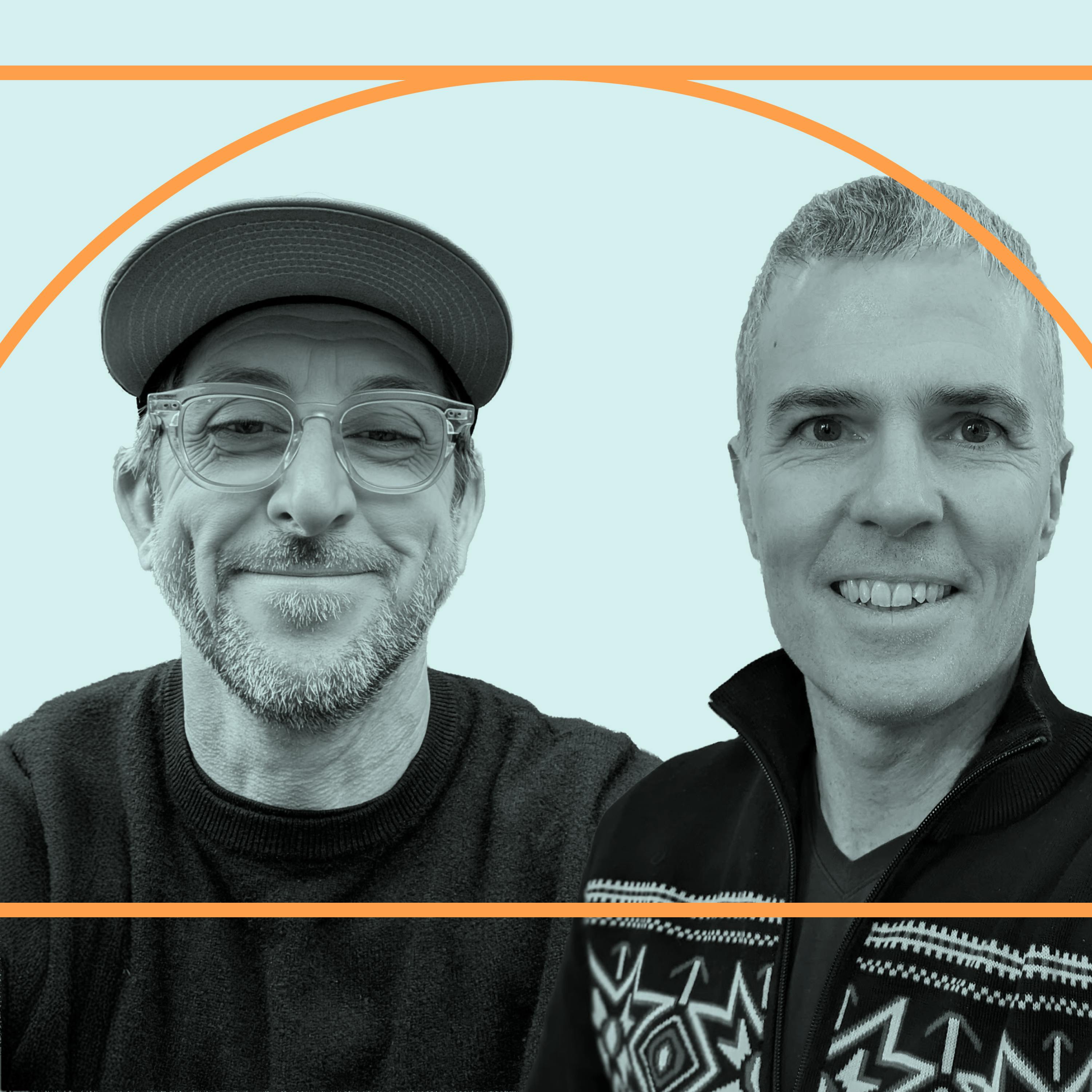
Nate Koechly and Matthew Darby: YouTube's UX Director and Director of PM on redesigning one of the world's most-used apps
43m 22s
Over the past four years, YouTube's UX director Nate Kesley and product director Matthew Darby have led a major redesign to modernize the app, addressing feedback that it felt outdated. They bundled visual updates—such as refreshed iconography, a brighter video player, and color sampling—with functional "value features" like comment threading and enhanced playback controls. A central aspect of their approach was creating predictive measurement tools to gauge user perception of subjective qualities like modernity, which helped secure buy-in within Google's metrics-driven culture. The redesign process involved extensive user research, including competitive analysis and methodologies to understand true user intent and satisfaction. YouTube's evolution is largely organic, driven by creators and viewers who use the platform in diverse ways, from education to music. A key ongoing challenge is managing feature complexity while striving for a clean, distraction-free experience that empowers users without overwhelming them. The team emphasizes balancing innovation with simplicity to keep YouTube a dynamic yet intuitive stage for content and community.
I talk sometimes about wanting to put the best frame possible around every piece of content. Go to Museum, every piece of art has a custom frame around it. And so, what's our version of that? How can we make each individual piece of content, each individual user experience in the best possible light? And then for the users, how do you give them the most agency, the most empowerment within that place? When you mesh those things together, there's just lots of stuff that can emerge. But it's just endlessly interesting. Redesigning one of the world's most used apps is no small feat. Especially when that app is also the second largest search engine in the world. Of course, I'm describing YouTube. Over the last four years, Nate Kesley, UX director at YouTube and Matthew Darby, director of product management, have been leading an ambitious effort to balance Google's metrics-driven culture with the subjective challenge of making an app feel more modern. In our conversation, Nate and Matt share how they develop predictive measurement tools to gauge user perception. Why they pair visual updates with quality of life features like comment threading and improve video controls, and how their research process has evolved from measuring clicks to understanding satisfied watch time. We also dig into one of YouTube's most complex challenges, the algorithm. As Nate and Matt explain what users say they want, doesn't always match what actually makes them happy on the platform. They also discuss their work exploring ways to give viewers more agency and control, including the possibility of using natural language to tune your feet. Both guests have a genuine passion for how YouTube enables deep expertise and niche interests to find their audiences, from 3D models of the Golden Gate Bridge to forest fire education from Northern California lookouts. Behind the algorithms and design updates is a platform where, as Nate puts it, when you give people a voice, the things they say are just inspiring. This is Design Better, where we explore creativity at the intersection, design and technology I'm Eli Walter. And I'm Aaron Walter. At Design Better, our primary mission is to produce work that helps people like you refine your craft, improve your collaboration skills, and get inspired by the creative process of others. If you enjoy what we do here, the best way to support us is to become a premium subscriber at designbetterpodcast.com/subscribe. We'll return to the conversation after this quick break. Design Better is brought to you by WIC Studio, the platform built for all web creators to design, develop and manage exceptional web projects at scale. Learn more at WICS.com/Studio. And now, back to the show. Nate Keckley and Matt Darby, welcome to Design Better. Thanks for having us. You guys have been working on YouTube for quite a while, both of you. YouTube is one of my personal favorite platforms. It's kind of changed my life in many ways. I learned so much from it. I've probably spent too much time there, like most people. You've been working on a lot of new release stuff as of late. Could you give us just like a quick walkthrough of some of the ideas that have recently come to pass? Nate and I have been working for four years now, actually. We've been doing these bundles we call them internally. And they have like a city name space. So we named them alphabetically. So the first one we did was Amsterdam in 2021 and we just launched Delhi this year. The sort of genesis of that program was the app had just got out of date. I think everybody in the company sort of recognized that the design was lagging competitors. We'd also heard that feedback from viewers as well. We did like a big UXR study that sort of got into all the details of how we were lagging behind. And so we went on this four-year journey and the goal was to modernize the app. So like a pretty sort of subjective goal, really. And Google doesn't always do well with subjective goals. And so each year we've got together like a collection of visual improvements that we predict are going to really improve users perception of modernity. And we have like a predictive measurement score that we developed for that purpose. And we've released them in a bundle together because we think it makes sense for visual design to go out as a cohesive whole. And we've paired them with what we call value features as well, like sort of quality of life improvements for viewers. So that when we go to market we can say, hey, there's a redesign and you consume into the video and you can hold down on the video and it plays a double speed. And so that's always been really nice for a sort of just a way to tell viewers how the app is changing. People are not always thrilled when it's just visual design, you know, and there's no sort of functional change. So as I say, we've done four of these now. The latest one that went out just two weeks ago actually, we updated all the iconography. So you'll see like a whole fresh set of icons with some nice little branding cues in there. There's some sort of angles that pick up the triangle that you see in the word mark. So they're sort of nicely subtly branded to be YouTube. We overhauled the player design so the player is much brighter than it is now. The controls obscure the content a lot less. We did some nice color sampling throughout the app. So if you open panels like the description, you'll see some color sampling based on the video. One quality of life value feature was comment threading so you can see comments presented in threads, which is pretty cool if you're a commenter in a comment reader. There's a new saving flow. We updated some of the motion in the app. We created some new search cards for musicians. So when I sort of bundle of changes, we did predictive measurement for all of these features before we launched them and then we do a confirmation measurement when we've actually launched them in the app to make sure that we did indeed increase for your perception of modernity. And so that's what we've done last four years. So Google, being Google, imagine that there's a fair bit of research quantitatively that goes on behind the scenes and there's probably some qualitative research as well. Maybe in that, you can both speak to your research process behind the redesign. I mean, I think first was to understand a bunch of objectives. What does it mean to be more modern? What does it mean to be more simple to create a more beautiful stage for the content, to help content shine, to increase efficiency and a bunch of other objectives. And those are themselves research derived, understanding how users perceive all those things, how users sort of compare really value all those things. From there, just lots and lots of different methods. So predictive sort of side by side, this versus that, against a bunch of sort of structured scales. Once things start getting into users' hands, diary studies, it depends on the project if we're putting things in the right place, lots of sort of information architecture, methodologies to where users expect features to be. And then as we start to scale up, we look at a lot of those constituent characteristics, how organizer things, how cleaner things, how appealing are things across the world around the world in different markets for different user segments and try to make sense of all that together. At the end of the day, we're always focused on creating a better user experience, helping users have more long-term joy, long-term satisfaction. And so everything does start with understanding the user and we just keep striving to find new methodologies to do that. We have a lot of metrics, which are proxies for how users are engaging with things and valuing things. But we're always trying to get better proxies and get closer to true user intent, true user feeling. And so continuing to innovate on the research methodologies that give us that as a big part of it. I think the UXR methodology that we created here was actually the most crucial part of this four-year project. The subjective part of design, whether something is beautiful, whether something is modern, those are the kinds of qualities of design that Google just culturally doesn't do all that well with, because it's very difficult to really know what success looks like or how you would measure something like that. And so we put together this program where we measure each of the proposed changes before we build them and we get a scorecard and the scorecards, pretty sophisticated actually, you get like different demographic breakdowns and sort of gender breakdowns and so on. And we can also iterate on desires. It's very useful for being able to get qualitative feedback on like, well, I didn't like this and we really like that other part of the design. That was really useful to get a slate of features and then this confirmation, once we'd launched to see actually, once we put them all together in the product, we measure this in a hold back. And that was really essential for convincing the organization that this was a thing that's worth doing in a culture where it's very metrics-based, it's very engineering-based, having that level of rigor. Rigger that was based in asking viewers about how they felt about these design changes was like, super essential for us to get the sort of organizational runway to run the program. I think this is interesting, like if it can be quantified, then it's true and if it cannot be quantified, then it is not true, which to me seems like that's just false because we go through life every day and there's so much that's qualitative and we know those qualitative things to be wonderful and true. Can we quantify the quality of walking through a forest that that is good for our human experience? Probably not, we could try, but is it useful? Still good and important to have. I want to return back to that original premise that you had, Matt, you said there was some feedback from the user base that said the app feels out of date. That's something that cannot be quantified, but yet that does boil down to business metrics. How long are people staying on YouTube? Are they watching multiple videos or are they staying with videos, etc.? How do you frame it or do you frame these sorts of qualitative things in a competitive way to say like, "Hey, we're looking at. "
these competitors, and here's what they have. We don't have their metrics necessarily, but we know that this is an important thing for us to consider because YouTube, it's a consumer-facing product. It's a consumer-facing platform. How do you frame that with competitive metrics? - We do consider that. I mean, first and foremost, you know, we're interested in letting viewers decide what's working for them, what content they wanna watch, how they wanna watch it, which features they wanna use. We keep going back to our roots of being user first, viewer first, creator first. But then it's also interesting to learn from the industry. Of course, these users are using many products also, and so that's part of the experience. And so when we do a lot of research, we do assess competitors also, and ask users about those differences and see what they associate with us and what they associate with others, and strategically how we think about that. And then maybe more meta or zooming out a little bit. The tech is such, and these apps and media and content is such a part of culture that we aren't just competing on raw technology, you're competing on the role you play in a user's life and what they turn to you for. And so you are competing on the quality of the experience in addition to the quality of the content, and how well the tools fit into people's lives. And then one interesting thing we did here from users in a much of that research was they do expect the products to be progressive and to keep changing. You look at cars, they redesign every year, fashion as to run away seasons a year, change as part of the expectation. And we really heard users telling us that to keep up, to be progressive, the latest and greatest. So it's both, we look internally at our users first, we're inspired by a lot of the great things happening across the industry and viewers' lives and users' lives in different ways. And then we try to listen to what they're telling us. Matt and Nate, you've both been at Google a long time. I think almost 30 years combined, maybe, if I'm doing the math right, from your profiles. And I realize not all your time has been spent on YouTube, but YouTube itself has been around for 20 years. Maybe you could each give your personal perspectives on how the product, as evolved over the years, the cultural impact. I mean, it's kind of come about in unexpected ways. It's become a music platform. It's becoming the most popular podcast platform. It's becoming an education platform. So yeah, just curious, just given the time you've spent at Google and with YouTube, each of your thoughts there. Yeah, and I've spent almost my entire Google career at YouTube, actually. I joined not so long after the acquisition in retrospect. I'm sure at the time the people that were acquired was like a year or two. So yeah, it's changed at all recognition, I think. I mean, both the product and the organization as well, the organization is completely unrecognizable from what it was back then. It was, I think, about 300 people maybe working on YouTube when I first joined, and of course, the technology as well. So it's very different. I don't think anybody really exactly for saw what it was going to become as well. I mean, it's a very organic process. The ecosystem in particular is sort of grown in this organic way that was difficult, maybe impossible to predict. Looking back, it was just a lot of sort of throwing ideas at the wall and seeing which one stuck to the wall really. I wish I could tell you that there was some grand plan that we had like a much greater vision for the platform and the products. And it was just a website back in 2008, 2009. My first few years as a product manager, I was like, mostly pretty embarrassed about the product. It looks pretty low rent for a long time as well. So it's really been a journey to see it evolve from that and so now I think an absolutely world class organization a product that is important in the world. And I think is a force for good in the world without getting too misty-eyed about it. So seeing that transformation has been a real treat. I think it's been fun to have our 20th birthday and to think about that journey and to think about sort of what's next. And I think I've always loved Google's mission and I feel it's pretty timeless and I think YouTube's is too. And I think the dovetail nicely. So if Google is making all the world's knowledge useful and accessible and YouTube is about giving everybody a voice and showing them the world. And I think that mission continues to sort of inspire us. But it's been wild to see something that started out in the zoo turn into something that is redefining how the world connects and consumes and learns and watches, listens, and all the other things that we've sort of grown into. We talk a surprising amount about the mission and trying to do that. And again, it's been a nice to reflect on 20 years and to think about the next 20 ahead and stay energized to keep facilitating that evolution of the world. - It's been fun to watch YouTube evolve in unexpected ways. It's unique in that it's a product that has such a dedicated user base that they use the product in unexpected ways. You probably didn't expect that people would use YouTube as their music platform. And then that spins off another product, which is YouTube music. And it's now the biggest podcast platform as well. How do you find these kind of user generated what seem like adjacencies or adjacent use cases and then respond to those and bring that back into the product strategy? - Well, I mean, it starts with creators and the things that they're doing and the way that they're engaging with their audiences. And so Neil talks about just wanting to build the best stage for that creativity and for that connection. And I think that's where all the creativity comes from and where a lot of the insights come from. There's tons of just media formats that wouldn't have been greenlit in traditional contexts, but a creator's onto something and a viewer resonates with it. And now you've got all these new formats on boxing or this or that that people sort of didn't see. And so really we're just trying to let that happen and then facilitate it. And so we focus on just sort of the core user journey, which is fine content, a mercen content, dive deeper into the content of the community around it. On the one hand, it's quite straightforward, but that gives rise to all these specialized experiences and these different user journeys and different sort of sub segments within that. You know, we did some really interesting research a few years ago on what users do while they're watching and trying to think through, well, okay, well, what does it mean when you're watching a video and you're cooking and your hands are dirty? What features do you need at that moment? When you're jogging, listening to a podcast, what features do you need? And so that same sort of core user journey exists in all these places. You go to a museum, every piece of art has a custom frame around it. And so once our version of that, how can we make each individual piece of content each individual user experience in the best possible light with the most capability? When you mesh those things together, there's just lots of stuff that can emerge, but it's tricky to allow all that specialization to emerge while still being tractable and clear and simple and easy to use. It's just endlessly interesting. Matt, your role as a product manager, I'm curious how you think about a product that's been around for so long, and products naturally tend to accrete features and grow and spread. And occasionally you have to assess and say, do we need to cut this or rethink this? What's that process been like from your side? That is a challenge, yeah. I mean, it's particularly a challenge, because Google famously has this very bottom-up culture. And so we have lots of teams that are broadly empowered to launch stuff in the apps. And part of my job actually is to build the frameworks and the patterns and the reusable components to allow teams to do that easily. But that does mean that you end up with a lot of stuff in the app. There's lots and lots of features. And some of those features end up taking off and some of them don't. I think we could definitely be a lot better at identifying features that are not doing so well. We were just discussing this last week, actually. And what do we do about that? The conceptual model just keeps getting more and more and more complicated unless you do something about it. And I think that does create the opposite of what Nate was talking about earlier, like the idea that it can be a simple app and a beautiful app. And the more craft that there is and the more complexity there is in the conceptual model, the harder that is to achieve. It's really a lot of work. It's not easy usually to deprecate features, because there's usually a community that loves that feature on Will Howe, Mitaly, the suggestion of its removal. But it is a necessary thing to do over time. And we need to get better at it, frankly, as well. Because the removal, and there's also just trying to increase relevance for individual users. And so when we thought about years ago, we tried to understand modernity and what users wanted in this era. They wanted clean and distraction free, largely. But because there are so many different user journeys, it's not so much about what you have and what you don't have. It's how do you have the right thing at the right time in an efficient, understandable, sort of repeatable way. More personalization, more tailoring, more on demand is also part of it in addition to tending the garden, sort of rigorously over time. Google has this term, CUJ customer user journeys. Is that something that guides most of the work that the design team is doing? Yes. Yeah, critical user journeys, customer user journeys. Yeah, like what's the flow through the app? Where's Main Street, where they call this X? A bunch of different metaphors you can layer on. But yeah, if you're trying to design for the user first and foremost, you have to understand what journey they're on, what their motivations are, what their context is. And I think that's excitingly so much more powerful. There's so much more potential there, sort of emerging now. It feels like as we can continue to tailor the experience for individuals. But yeah, we do focus a lot on that. And I think the fundamental viewer user journeys, like I said before, immersed, dive deeper, move on, find content. And then there's subsets of those. The list gets really long, really quickly. But it also can get that clear. But yeah, we talk a lot about user journeys and the intent of the user--
are at a given moment and now to help them achieve their goals. Yeah, we spend a lot of time thinking about those journeys. These three goals of watching, you want to be immersed in the video, then you want to dive deeper and find out more stuff about the video. We spent several years investing in the video player and we actually launched like a ton of features like video zoom, where you can zoom into the player, chapters, a feature we call speedmaster where you can hold down on the player and have it play a double speed, like extra speeds for premium users. Like a whole suite of features that work together as a system. We spend many years like sweating the details on those and that's really in service of this BMERCE user journey that you really want to find exactly the right point in the video. Heat Seeker, which is like the little heat map that you get as you sort of scroll around and you can find interesting points in the video that other people are watching. And that was a multi-year journey that was just to make that one critical user journey that much better. My favorite feature in that suite is we call it internally double tap to seek where you like double tap on either side of the player so like skip forwards and backwards five seconds. We launched that meant for several years ago now actually and it's been copied a lot. I think most good video players have it. I think it's a killer feature because it was really difficult to seek inside the video before it's super tedious to use the scrubber bar which is the little bar on the bottom. And B, it was actually a nice demonstration of when the bottom up culture is a real benefit to doing product development because it was one of our designers. She came up with the original idea for using the double tap on either side and the inside was that it was on different sides at different speeds seems obvious in retrospect. But we were actually very constrained. We didn't want to use swipe because we had another idea for swipe. We already had tap so she had these kind of leftover gestures and managed to repurpose them. And then somebody else came up with another designer on the team that came up with or there's a product manager that she came up with the idea that you should be able to mash so that you can just keep tapping and it would just advance a long way. And then another designer came up with the idea that you'd have to have like the indicators to show you how many seconds you're advancing. And then there was an engineer that reached out to me as we were getting the launched and he said, how close does it have to be? Does it have to be exactly 10 seconds? And I was like, well, not necessarily. It's more, you know, you're trying to get back to what was just said, you know, like, I'm going to miss something. What was that moment that was just said? And so he introduced this idea that we would snap to the nearest key frame. And this is a detail about how video encoding works. And every 10 seconds we send a key frame and the key frames are just a full representation of the video frame and they're much faster for the client to decode and put on the screen. Whereas the intermediate frames, you have to do some math to figure out what the differences are. And so it just speeded it up by a few milliseconds. It just made it a little tiny bit snap here by snapping to the key frame. And actually if you use the feature, you'll find that you sometimes jump five seconds, sometimes you'll jump 15 seconds. And so anyway, it was a nice synthesis of all of these different disciplines and different ideas from people across the team. And it went on to be a gangbusters feature that gets used a ton in the app. What are the challenges of redesigning and launching new features on a platform that is servicing billions of people every day? It's an enormous challenge. Every feature that we launch, we launch in a Navy test. I mean, it's the only way that you can launch at scale. So even the smallest thing, even if it's a bug fix, sometimes we'll just test it in a Navy test to see what happens. Sometimes we even do things like we have the code available for the feature and we'll just launch the code without even switching the feature and run a Navy test on that just to see what effect putting the code in the client had. We're always trying to measure the effect on the ecosystem. And also there's a lot of tragedy of the commons dynamics that can work out. If you don't pay attention to them like crack, you can slowly, slowly make the crash rate get worse and worse and worse with lots and lots of features. So lots of system health metrics, for instance, we track in the client to make sure that the client's still in a healthy state. And yes, there's like thousands and thousands of metrics way too many metrics and it's putting a new, something brand new into that dynamic nature of the ecosystem and seeing how things change inside the ecosystem. Quite often there are these zero-sum trades. If you get some engagement here, it comes at the expense of some other surface over here. So it's almost always a pretty delicate balance and there's a lot of analysis that we do and a lot of metrics that we look at. Design Better is brought to you by our pals at Wix Studio. If you want to grow your agency or your independent work that you're doing for clients, you need more than just a website builder. You need Wix Studio. It's the all-in-one platform that's built to help you scale. You can design smarter and a hyper-flexible, responsive editor, cherry picking whatever your clients need from pre-built UI elements and templates. You can deliver robust back-ends with built-in e-commerce solutions for every industry, letting self-maintaining infrastructure just run itself. And stop reinventing the wheel for every project. You can create shareable design systems with reusable assets, apps and components. If your clients are growing really fast, no sweat. Wix Studio's AI-powered CMS lets you turn a single layout into hundreds of dynamic pages. It's true, more clients no longer has to mean more chaos. Wix Studio gives you one centralized view of every project and it makes real-time collaboration just seamless. Do your agency's best work at scale. Build your next project on Wix Studio. It's an incredible platform. It's WixStudio.com. Learn more at Wix STUDIO.com. WixStudio.com. So we're just about half an hour in and we have not yet mentioned AI, which is probably refreshing for a lot of people, but I'll break our streak there and just ask curious mostly about how AI is affecting search and since YouTube's the second largest search platform at the moment. It's obviously disrupting all kinds of search, but I wonder how you're thinking about it from a product standpoint and a discovery standpoint for your users and what you kind of see that trajectory like. Yeah, super interesting times. I zoom out a little bit first and think about the progression of sort of the internet eras through them all. It's about getting more capabilities for users and about technology that gets you closer to true user intent and true understanding of what the user is trying to accomplish. And so specifically, language really reduces that gap. In the web 1.0 days, everything was done through four elements and then in web 2.0, you could directly manipulate things and then in mobile, you were freed from tables and grid-based layouts and you could have sort of bespoke designs that more closely matched the users expectations and mental models. And I think now with language and with presumably reduced cost of sort of interface development over time, it enables us to have a better picture of what the user is actually trying to accomplish and then hopefully the product design capabilities to meet that even more closely. The world learned how to talk in a pretty optimized way with short queries and now that language is more accessible to more people, we're seeing more expressive queries and people bringing new questions forward to us. So I think that's really interesting. What we can do with that is we'll see, but I think when users have higher expectations of us, it just gives us new moments to meet. And so maybe when you're trying to find the best thing to do on a trip or the best way to fix this thing, it just lets us be more efficient. We hope where we can identify more clearly what the users want and then find that information in new places. So it might not just be from a single video, we might be able to bring a set of videos to a user in a new way and explain it. So that's one thought. Second thought maybe that goes with it is what is video good at and how can we make that work better. Sometimes I think about the history of text and all the tools that have developed around text and all the things you can do with text, you can snip it and you can skim it and you can morph it in different ways that are more challenging today with video. And so what is a good snippet? What is a good narration? How do you help explain the context around the videos to a user in new ways? And so I think it's pretty early days, but to have so many new raw materials available, I think it's pretty exciting. I think as a result, we also do see users bringing more queries to YouTube and more query diversity and users come to YouTube for entertainment, but they also come for a lot of information and a lot of connection. And we're starting to see that. And I think with more expressive design and with the ability to sort of craft a better response to each query, we're super excited about it. How are shorts changing the way you think about the product? Well, one thing they've told us is that users value for some journeys efficiency is really important. And getting to the essence of the answer or getting to the essence of the joke or the story or the insight. And so I think shorts and short form video in general have increased our thinking around content efficiency and getting people to the heart of what they're looking for even faster. So that's one dimension. I think another dimension is the amount of participants. We continue to lower the bar to be a creator, to be creative, to put something out in the world. It can be a big project to put together a long form video. And so more people are getting to experiment with new ways to be creative and to communicate thanks to short form video. So I think that's like a dynamic that will play out for a long time, presumably. Right now, they're sort of squished together where you get like a block of shorts and then a block of shorts.
of long-form videos. Do you think about those as different, like, is that a fork in the road where maybe there's two different pathways for users? Well, I think there's a lot of different user intents. And so sometimes you're looking for a specific video, and that's sort of one path. In other times, you're really looking for a set videos or just for a scrolling, sort of content experience itself, more than an individual piece of content, particularly. So I think that is a pretty distinct, or it can be a pretty distinct sort of user intention. But it's not the only one. I mean, sometimes people want to lean in, sometimes they want to lean out, sometimes they're looking to be really active and guide like a research session and poke around and curate and find a lot of things. And other times, they're looking for a different experience. So I don't think that's the only fork in the road, but I do think that is a distinct user journey at times. We have done quite a bit of experimentation with mixed feeds as well, where we mix what we call VODs, non-shorts and shorts together. And they can actually end in some circumstances perform quite well. It's definitely something we're looking at. It's not completely straightforward, but definitely something that we're working on and we're aware of. - How do you think about prioritizing the different user groups that make the use of the platform? Obviously, there's probably some, definitely some business decisions that are made there, but also from your own perspective, as product and design leaders, what does that prioritization look like? - I was thinking about this actually when Aaron was asking earlier about all of the different sort of niche uses and niche user journeys. And Nate and my teams, we really think of the broad set of users. So we're trying to build features that are just generally useful across the platform. And most of the teams that are adjacent to us are trying to keep the health of the ecosystem at large in really good shape. And that allows these different communities to flourish, as Nate was saying. There's a team that just looks at podcasts and they're building podcast features. And yes, we have to figure out how to sort of fit that in such that it feels connected and integrated into the app. That can be a challenge. Same with music features, same with premium members have their own sets of features. So that's an ongoing discussion. It's not the most straightforward thing actually to sort of bring those in at the right times, but that's what we aspire to do. - I guess I would just add that, well, I mean, there's a lot of people on YouTube. And so we look at lots of slices of the user group and we do, you know, focused user research into different segments, you know, from time to time. And a lot of that is just to track the health and to try to identify any blind spots or any areas where we're not serving people as well as we could. It is important that things to be diligent and look at different segments and look at different sort of usage behaviors and really use that as a way to sort of triangulate what's working and what isn't and where sort of the opportunity is. It's less about prioritizing specific groups and it's more about, I think, prioritizing the aggregate health. It's also interesting to see different segments teach us different things. And so, you know, the way podcasts consumers consume content is a little bit different than the way sports people do and all of that can be inspiring. Maybe one more interesting dynamic, I think, is looking around the world and the internet and YouTube plays a different role in different markets. Then the same way we saw sort of mobile have different characteristics on different continents and different, you know, it's sort of when different markets mature and what technology was sort of most prevalent right then. So it is interesting, you know, we see interesting information seeking journeys in India that we don't see as much in some other countries, for example. And so, that just reminds us to keep looking and to keep trying to understand more. At this scale, there's just so much diversity that on some sense, it aggregates out or averages out, but that's a risk. And so it's important to keep drilling in everywhere and understanding. - One thing I'd say as well, that might be surprising is in general, like, night and my teams, well, I mean, we measure the business impact, but that's not a goal for our teams. Like, we don't have a revenue goal. We're just thinking about how can we deliver value to viewers? And that's very intentional. There's a separation of church and state. Now, we work with the ads teams quite closely and mostly our interests are like totally aligned right. We wanna do the right thing for viewers. But in general, we wanna just deliver as much value for viewers that creates a healthy ecosystem from the viewer point of view and that makes a bigger opportunity for the teams to monetize in different ways. I'm curious how you think about the algorithm because the algorithm in YouTube is quite good. I discover so many wonderful things through the algorithm. But there are also times where it's like, I'm stuck in a loop and I wanna kind of break out of that. There's a button up at the top new to you. And I've often thought, like, I wish there was like, I could dial it up to 11 where I could really just scramble the whole thing. How do you think about the algorithm and the experience it creates for people? - One way to think about it is that the algorithm sort of is the audience. It's job when it does well is to represent what that user wants. And I think we believe that there's content on YouTube for everybody and it's our job to help find it. So at its basic level, it's that. But it's interesting to try to design for these probabilistic and things that aren't sort of deterministic. It's not just one in, one out. And so one, one are all the right signals and what are we sort of optimizing for? We want long-term satisfaction, but long-term value, long-term satisfaction. And so our understanding of that has changed a lot over the years. Early on, we were measuring clicks and then watch time and then satisfied watch time as a subset of overall watch time. And we keep trying to figure that out. And then we try to figure out the things that detract from that. So the content that might be totally fine and beloved by one user might be off-putting for another user. So we have to figure out how to model things like that. And then users have other characteristics. They want freshness. They want novelty. They want tried and true. And so how do you manage all of those things together when you really just have a flat list to present by default at the end? Can I give you a use case? Yeah, please. So lots of people use YouTube to do research, especially on products. Researching a car that you might buy or some other thing. And then you've made that purchase. You are no longer researching. And yet you just get the endless feed of, you're all the cars. Those sorts of scenarios where what I wanted has changed and now it's totally different. Are those parts of your conversation around the algorithm? That's definitely part of the conversation. And the time of day and the device you're on, you probably want to slightly different piece of content on Friday night on your couch in the living room, then you do on the road. And it's really tricky to identify those sessions. And so it's an interesting blend between explicit and implicit. How much can we just predict and how carefully can we pay attention and respond versus when is the right answer just to ask the user and to listen to that? We also see the dynamic where what people say isn't always what they do. And so you have to balance those two things out. But in general, we're trying to give more agency and more responsiveness based on increasingly nuanced understandings of what satisfies a particular journey. And so in the case of music, maybe the priority is to give you five songs in a row without you having to change the channel. Whereas that wouldn't be the goal at all on like a research journey where we want to give you more diversity and let you sort of hone in on it. And so it's tricky to come up with UIs that are simple enough to get out of the way, but still enable you to sort of get what you want. And we have a long way to go. That's an endless quest. That's something we hear from users all the time, actually, is that they would like the ability to tune their algorithm more precisely. It is something that we're working on in sort of two ways, giving viewers insight into what we know about them, the inputs into the algorithm, the things that we know that they're interested in. We are also exploring ways where you could tune the inputs. It's really not straightforward. As Nate said, quite often viewers, they want one thing. And actually, you can show empirically that that's actually bad for their usage on the platform. So that's a big dynamic that we have to navigate. But it's definitely something that we hear. It's definitely something that we're interested in and working on. And it's an area I think where we're like have renewed interest, the sensitivity to the signals, like the things that we can measure is increasing. But more importantly, I hope, and we're starting to see some early signs that user expectations are changing. And so the ability to tell us how to change your feed with natural language instead of with a bunch of bells and whistles is interesting, certainly for some users at least. And so it does feel like the tools we have to approach this problem are changing really rapidly right now. Do you guys remember that episode of "Sign Felt" where Kramer is pretending to be a movie phone? And George and Jerry, they would call in and try to get answers. And finally, it was just like, why don't you just tell me what you want? That's basically what you're describing. That's right. Yeah. And it's interesting, you know, users do so much on YouTube that it does reflect them in some ways. Or it can be a nice reflection. And so I think that's an interesting dynamic also. What's your favorite YouTube channel that you run until late? If it's not a full channel, it can just be a video or podcast or music too. Mark Lewis, actually, it's very obscure. He's like a middle-aged guy doing fitness stuff and building his home gym out in the country in England. And so I don't know. He has a lot of resonances for a middle-aged guy. He was also working on his fitness. And he has a very dry sense of humor. So I enjoy his content. Number one is Anna McGraths. This guy does 3D modeling. Like you just did the Golden Gate Bridge. He does like three or four videos a year. Works on him for months and months and months. And then models it and then flies around and describes it all. And so I drive across the Golden Gate Bridge a lot. I learned a ton. It's like an hour and a half video. And then he did another hour behind the scenes. And at the end of it, he just looks at the camera and just thanks.
audience for like enabling him to be so passionate about something and find these so many people that love the same thing. So to have a platform where that level of passion and craft and nicheness can find such success. And that's a different way of YouTube and then you think of, you know, the weekly vlog or whatever. And so I love that one. One other one is called the Lookout for those in Northern California. It's a person in the forest service that knows everything about like forest fires. And it's an example to me of again, somebody's like depth of expertise being there for the world. And also just the quality of the information like I've learned more from them about the climate around here than I have for many more traditional source. Case after case, when you give people a voice, the things they say are just inspiring. And those are two, I think, just sort of only on YouTube examples that I watch quite a bit. And you're so much more wholesome and educational than when you're going to have to give me those channels, Nate. There's more of that came from. There's something out there for everybody. I want to add one to your list. Have you guys seen Kursk-Zachd? Yeah, yeah, that's a favorite, yeah. Yeah, love that one. It's so good. Yeah, so well done. Yeah. That's the difficult thing, you know, having cost my mind back to sort of 2008 and 2009 to imagine that a channel like that could exist with that level of polish and production value. It's astonishing, really. Well, Nate and Matt, congratulations on the release. Thank you for making YouTube. It's just a wonderful resource. I love it so much. That's right. It was just me and Nate, by the way, I hasten to add. So you're definitely thanking the right guys. But it's nice when people say that, actually, one of the things that has made me stick around at YouTube, as well as it being a consumer product that I love and it's such a privilege to work on a consumer product that you love yourself. But yes, it's common when people ask you what you do. It's very common for people to say, I love YouTube and get a lot out of it and that's pretty special, actually. That's great. Thanks for being on Design Better. This episode was produced by Eli Wollery and me, Aaron Walter, with engineering and production support from Brian Pake of Pacific Audio. If you found this episode useful, we hope that you'll leave us a review on Apple podcasts, Spotify, or wherever you listen to finer shows. Or simply drop a link to the show in your team's Slack channel, DesignBetterPodcast.com. It'll really help others discover the show. Until next time.
Podcast Summary
Key Points:
YouTube's redesign focused on modernizing the app through visual updates (like new icons and a brighter player) paired with quality-of-life features such as comment threading and improved video controls.
A key innovation was developing predictive measurement tools to quantify subjective design goals like "modernity" and user perception, helping to align Google's metrics-driven culture with qualitative improvements.
The platform balances giving users agency and control with maintaining simplicity, while its evolution is driven by organic creator and viewer behavior, leading to unexpected uses like education and music.
Managing feature accretion and complexity is an ongoing challenge, requiring careful decisions about which features to enhance, simplify, or deprecate to keep the experience clean and user-focused.
Summary:
Over the past four years, YouTube's UX director Nate Kesley and product director Matthew Darby have led a major redesign to modernize the app, addressing feedback that it felt outdated. They bundled visual updates—such as refreshed iconography, a brighter video player, and color sampling—with functional "value features" like comment threading and enhanced playback controls. A central aspect of their approach was creating predictive measurement tools to gauge user perception of subjective qualities like modernity, which helped secure buy-in within Google's metrics-driven culture.
The redesign process involved extensive user research, including competitive analysis and methodologies to understand true user intent and satisfaction. YouTube's evolution is largely organic, driven by creators and viewers who use the platform in diverse ways, from education to music. A key ongoing challenge is managing feature complexity while striving for a clean, distraction-free experience that empowers users without overwhelming them.
The team emphasizes balancing innovation with simplicity to keep YouTube a dynamic yet intuitive stage for content and community.
FAQs
The goal was to modernize the YouTube app, addressing feedback that the design felt outdated, by bundling visual improvements with quality-of-life features to enhance user perception and experience.
YouTube uses predictive measurement tools, including scorecards with demographic breakdowns, to gauge user perception of modernity and other subjective qualities, followed by confirmation measurements after launch.
Recent updates include refreshed iconography with branding cues, a brighter player design with less obtrusive controls, comment threading, a new saving flow, and color sampling based on video content.
YouTube combines rigorous metrics with qualitative research, such as diary studies and user interviews, to understand subjective aspects like modernity and user satisfaction, ensuring a viewer-first approach.
Pairing visual updates with value features, like improved video controls, helps communicate changes to users more effectively, as visual-only updates may not be as well-received without functional benefits.
YouTube acknowledges the need to deprecate underused features to maintain simplicity, though it's challenging due to user attachment, and focuses on frameworks to manage complexity while keeping the app clean and distraction-free.
Chat with AI
Loading...
Pro features
Go deeper with this episode
Unlock creator-grade tools that turn any transcript into show notes and subtitle files.
 PodcastTranscript AI